Abstract:11 years of providing brokerage services mark an important milestone for OctaFX.

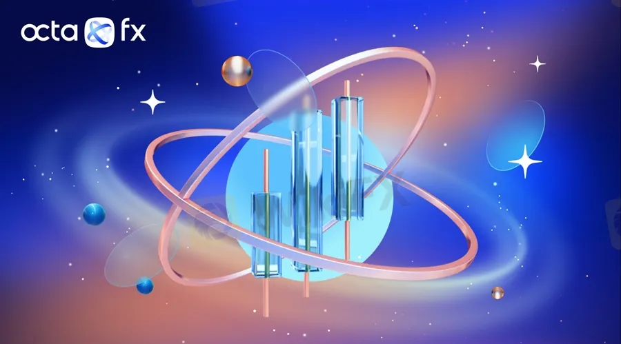
To mark its 11th anniversary, the global broker OctaFX rebranded, adopting a fresh new look with refined colours, space-inspired elements, and a new logo. Heres the story behind the new design system.
The concept

The main concept behind the rebranding is a reflection of the brokers mission: OctaFX exists to ensure everyone can achieve their investment goals. The broker weaved the core elements of its philosophy into a compelling narrative below:
‘We picture goals as stars in the broad universe of finance. Each one represents a unique combination of the needs and desires of a particular person. The journey towards the investment goal isn’t always easy—there are many obstacles on the way. To overcome them, traders need an optimal set of both analytical and financial instruments, as well as a reliable partner. We are here to provide them with everything necessary to make effective trading decisions and achieve investment goals. All the elements of our new design system convey this message in a simple, yet illustrative way, the OctaFX press office commented.

The two orbits forming OctaFX‘s new logo reflect the all-encompassing support it provides for traders on the journey towards their goals. The orbits cross each other in such a way as to create the word ’fx that highlights an important part of the company name.
‘When creating the logo, we really wanted to put all our support, care, and partner-like attitude towards our clients into it. However, we also wanted to emphasise our connection to Forex as a financial market, to which we are proud to serve as a gateway,’ the OctaFX design team explained.
The elements

The colours
The colour palette of deep blues reflects the confidence we have in our services, while the intense oranges give vibrancy to the new brand design, emphasising the dynamism and readiness to change.
‘Out of a wide spectrum of colours, we chose primarily blue and orange ones, which—in all their diverse and lively richness—we felt were the best choice to represent our brand in the financial world. We knew we could express the manifold nature of OctaFX—at once stable, focused, principled, and flexible, energetic, current—by skilfully combining those colours in our visual communications,’ the OctaFX design team concluded.
The transformation
The financial world is changing rapidly. New challenges emerge every day, and OctaFX is ready to evolve and transform in response, all to meet and exceed the expectations of its clients. The new branding was created to express that.


